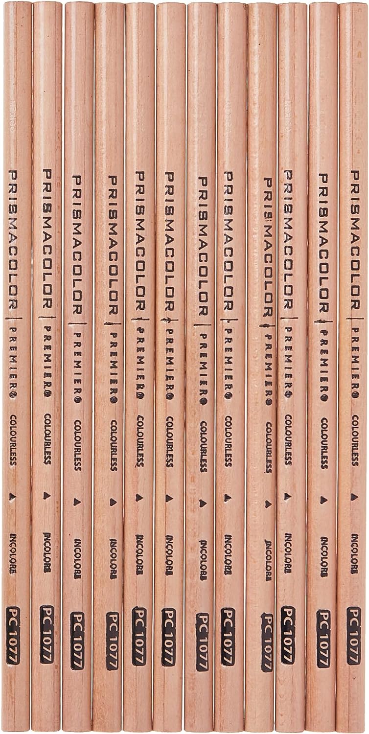
Use Prismacolor pencils for better results (or any professional quality soft colored pencils)
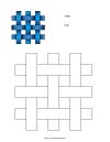
Print out the worksheets

by JuliannaKunstler.com
Use Prismacolor pencils for better results (or any professional quality soft colored pencils)
Print out the worksheets

Prismacolor scholar 48
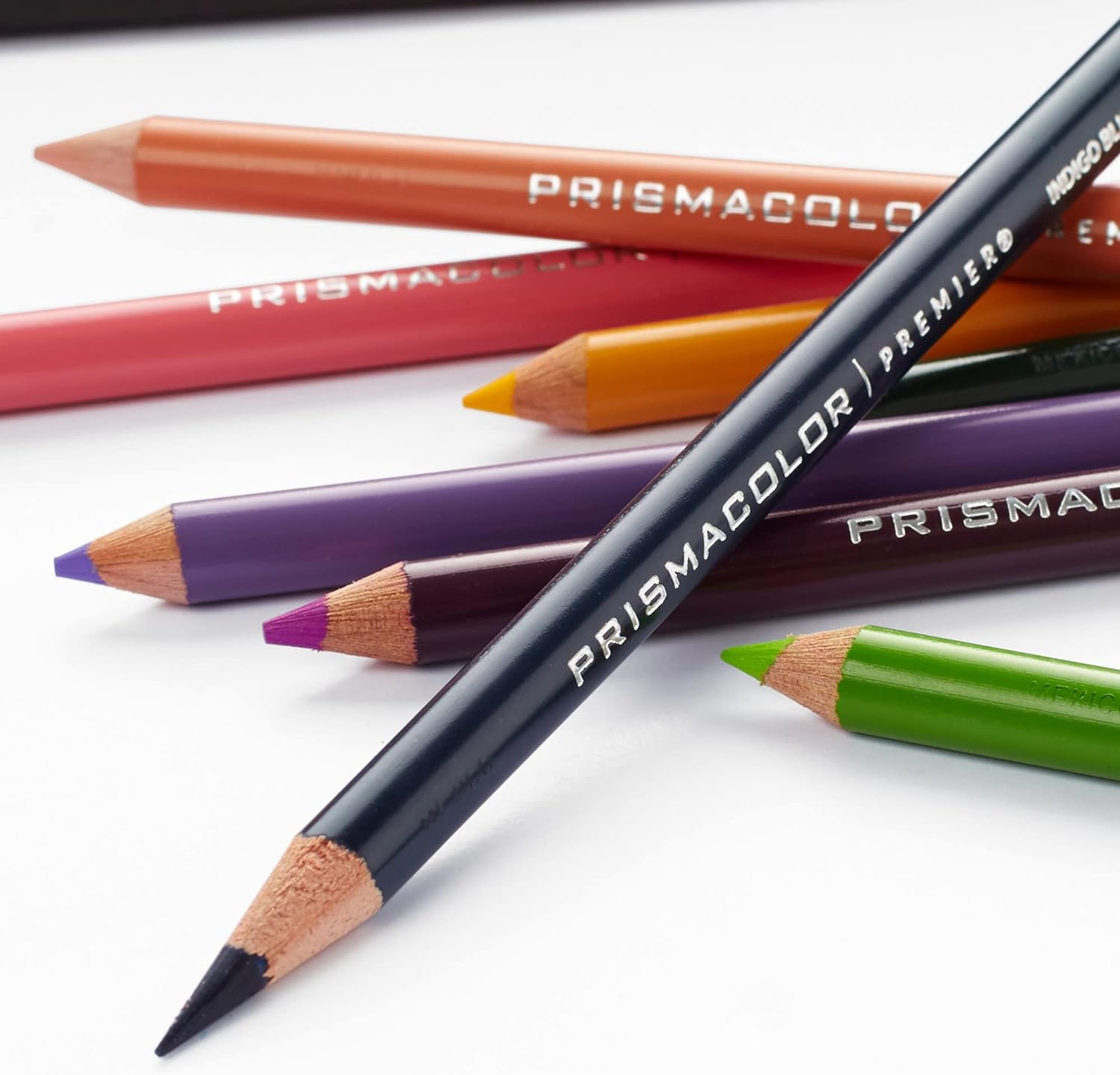
Prismacolor premier 24

Prismacolor premier 72
pencil blender 12
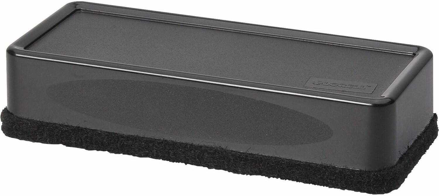
cleaner
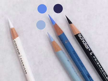
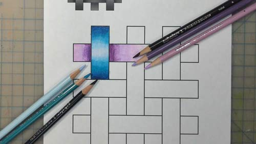
Once you chose a main color (medium blue) - you need to find two more pencils:
White pencil is always helpful to lighten areas, blend light colors, fix mistakes, etc.
IMPORTANT:
Sharpen the pencils before work. Continue sharpening them as you work on your assignment.
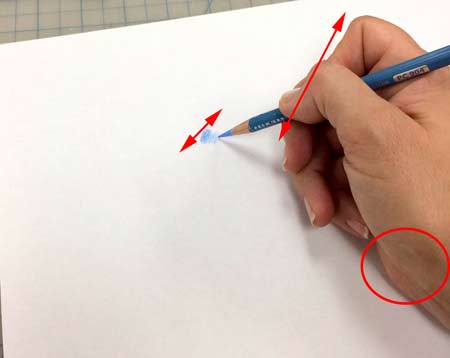
Practice shading with small strokes.
Your wrist should rest on the table, don't move it as you shade - move only the pencil - this way your strokes are tight and they are small. Reposition the wrist, then apply a new set of strokes - they can overlap, can be placed at different angles, or you can rotate the worksheet itself - whatever is more comfortable for you.
IMPORTANT:
Strokes should be small - this way it is easier to control you shading.
Try shading while changing the pressure that you apply to your pencil - from full coverage (full strength) to fading.
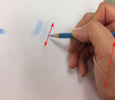
If you move your wrist while shading - the strokes will become longer and sketchy - this is not the result we want for this particular assignment.
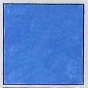
Stay inside the square.
No strokes and none of paper should be visible - solid, full strength coloring with small strokes.
Overlap strokes, make sure they fill in the entire area.
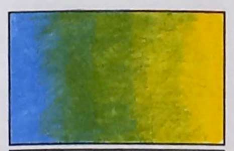
Use two pencils: medium color and the darker shade.
Follow the steps below.
Transition should be smooth, without a define border between the colors.
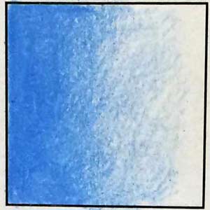
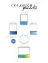
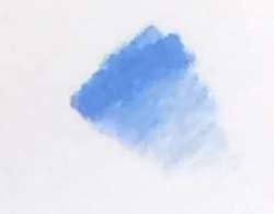
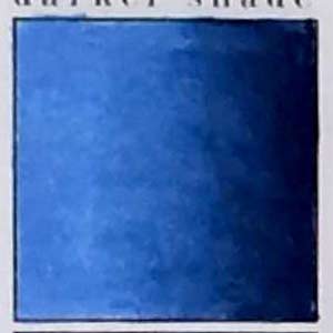
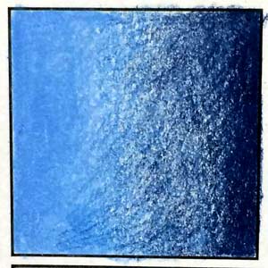
Shade the square with the main color:
Start on the left with the full strength, lightening the pressure towards the middle, then completely fading.
On the right:
Shade with the dark color - full strength on the right, fading towards the left side.
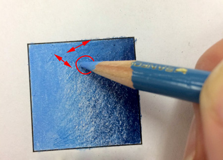
Use the first (main) color for blending.
Use small strokes in all directions, or use circular strokes.
IMPORTANT:
Always use the lighter color for blending.

Repeat the steps above with the main color and the lighter color.
Use the lighter color for blending.
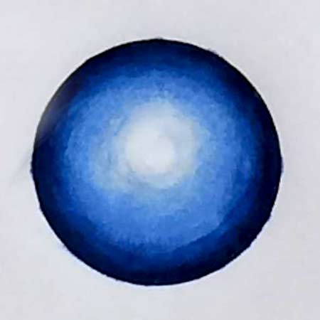
Create a 3-D shading (coloring) using all three pencils (main color + dark + light).
You can use WHITE pencil in the center for blending.
Strokes should follow the form.
Create a smooth transition from one color to another.
Remember to use the lighter color for mixing and blending.
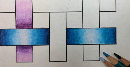
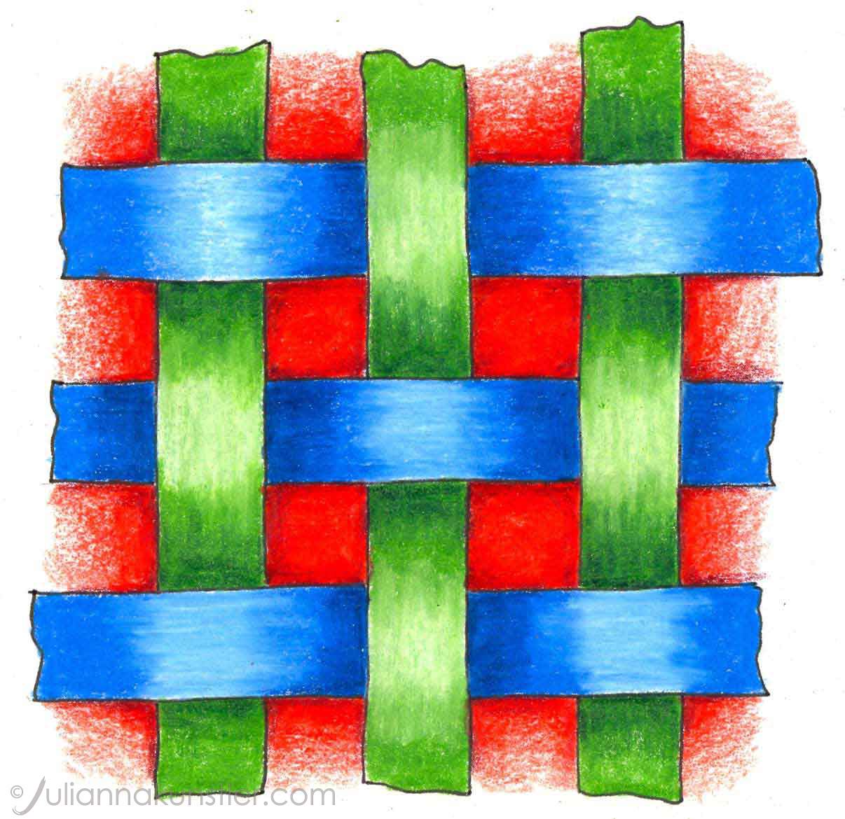
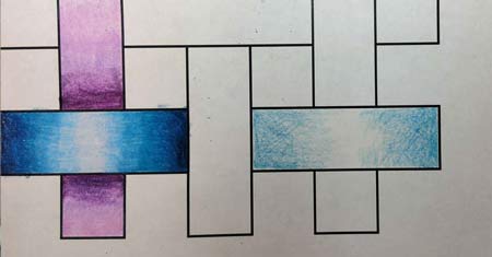
Use 3 color shades for each band:
Main color - medium value
Lighter value for highlights
Darker value for shades.
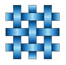
Observe highlights and shades in the weaving pattern.
Where are the lightest areas?
Where are the darkest?
Start with mid-value
Shade lightly
Leave the area in the middle blank.
Use short strokes! Control the pressure.
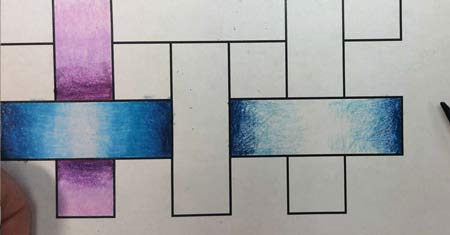
Next - the dark value.
Start shading at the edges. Use full strength, then fade towards the center. Control pressure.
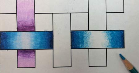
Use main color again as a blender:
Mix and blend colors in short circular strokes.
Fade towards center.
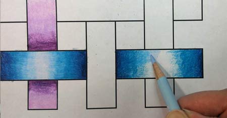
Last - is the lightest color.
Color full strength in the center and mix with the main color in short circular strokes.
The transition between the colors should be seamless.